Public-health data becomes more meaningful when complex statistics are translated into clear, geographically grounded visual information. This project demonstrates how thematic cartography can help communicate the spatial distribution of health indicators across countries and regions.
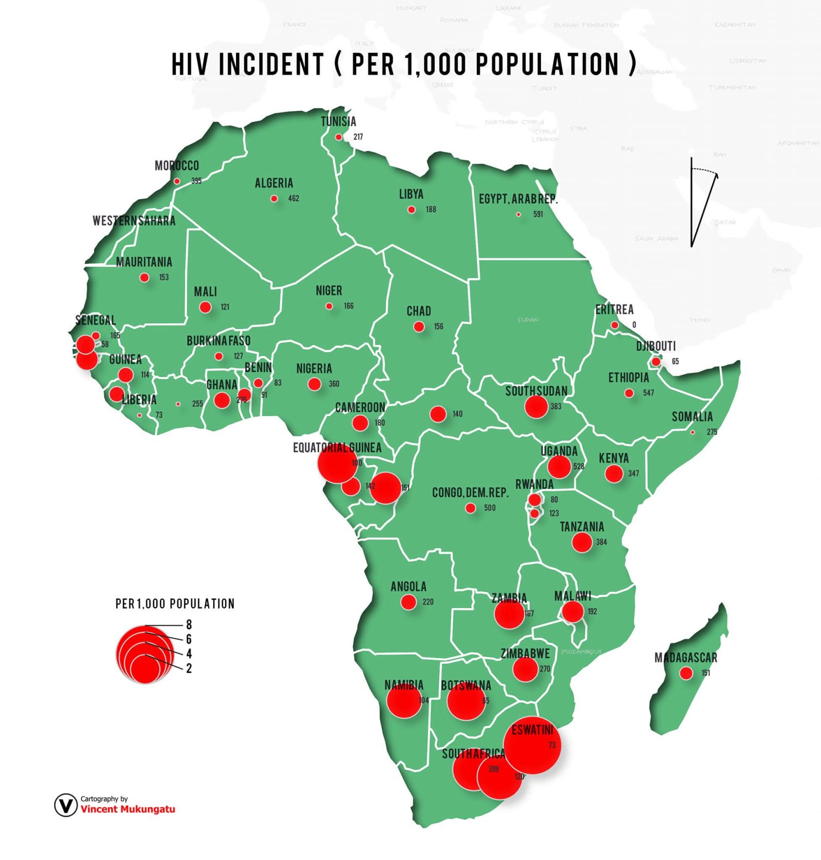
The map presents HIV-related incidence indicators across Africa using a continental geographic framework and proportional red circles to represent the mapped values. Country labels and numerical annotations provide additional context, while the contrasting colour scheme and symbol hierarchy help distinguish geographic features from the thematic data.
By combining geographic boundaries, proportional symbols and carefully arranged labels, the design creates a visual overview that allows readers to compare the displayed indicators across countries and identify broad regional patterns for further investigation.
The project demonstrates the application of thematic mapping principles to public-health communication, with an emphasis on visual hierarchy, geographic context, symbol scaling and accessible presentation of statistical information.
Turning Geographic Data into Insight Effective thematic cartography does more than display numbers on a map. It establishes a spatial context that helps audiences interpret data, compare locations and ask more informed questions about geographic patterns.
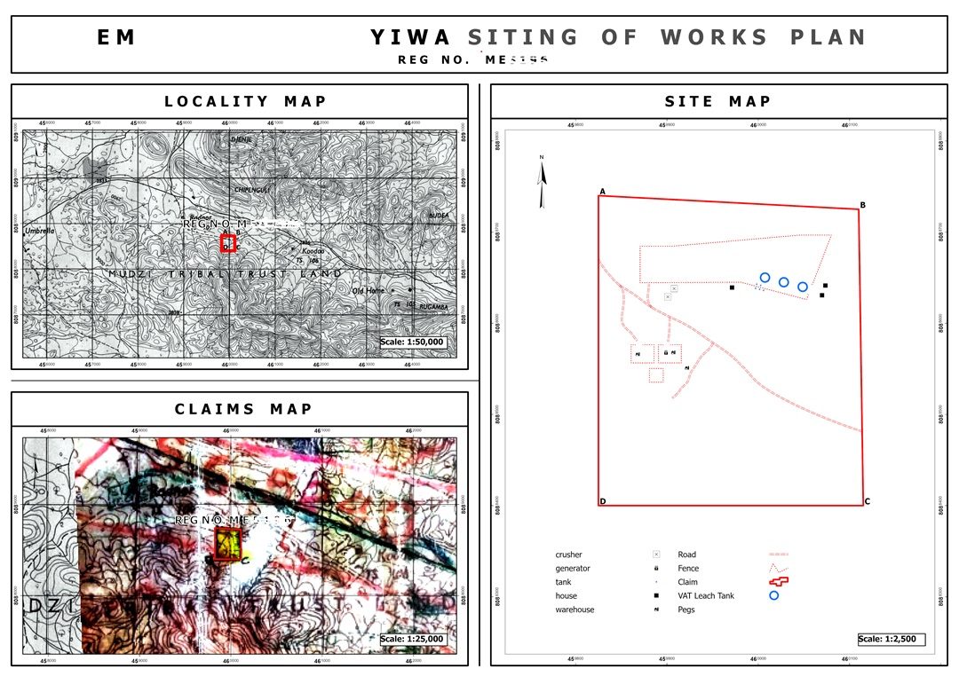
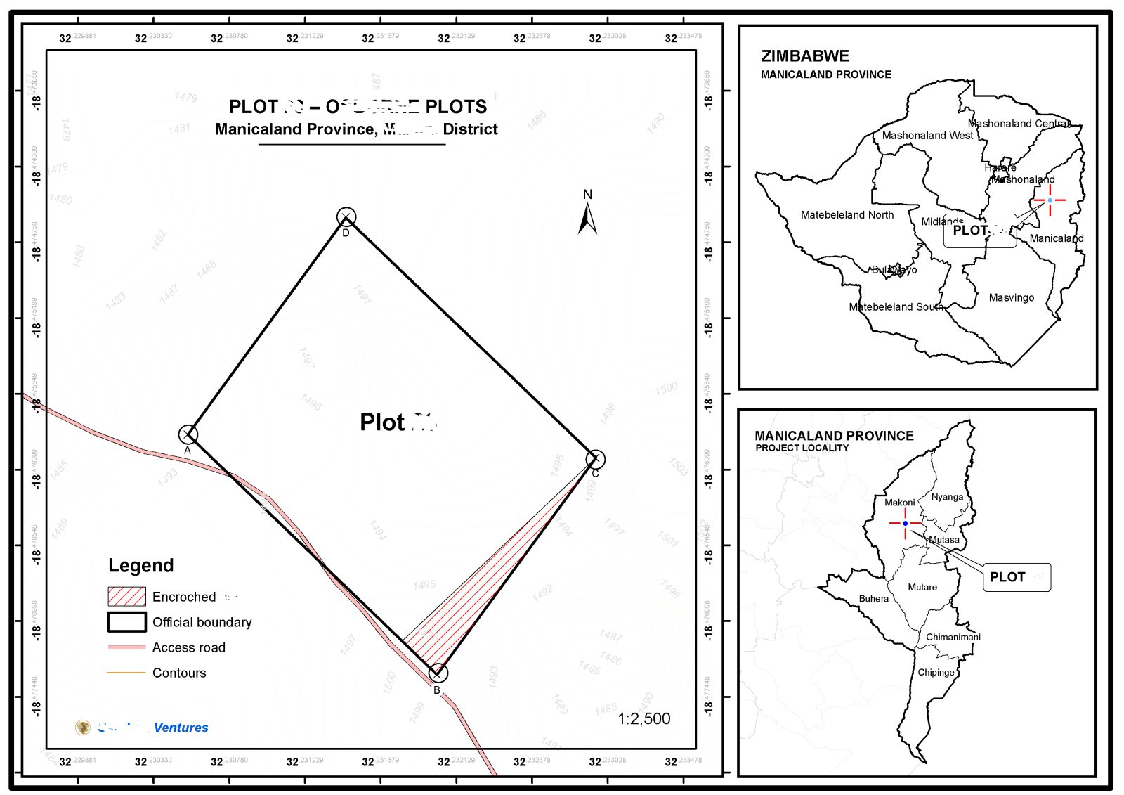
This map showcases cartographic design capabilities relevant to public-health reporting, epidemiological visualisation, development research, statistical communication and other applications where location-based data must be presented clearly and professionally.
Call to action
Need to transform complex datasets into clear, compelling maps? Apex Four Ventures can support your mapping and visualisation projects with professional cartographic design and geospatial data presentation.



 GIS Experts Zimbabwe